Flow Layouts and Using CSS for Responsive Design
This chapter covers different CSS layout strategies to make responsive BBj applications in the Dynamic Web Client.
Overview
Many projects use multiple layout strategies, as some are better suited to certain tasks than others. A DWC app can mix and match CSS layout techniques to build responsive apps that adapt to the client's display.
CSS Layout Options
CSS Flexbox
A flexible box layout designed for one-dimensional layout (row or column).

Best for:
- Windows with a few controls positioned next to one another
- Horizontal (
flex-direction: row) or vertical (flex-direction: column) layouts
Key features:
- Controls grow/shrink to fit available space
- Flexible ordering of items
CSS Grid
A grid-based layout system with two-dimensional layout (rows and columns).

Best for:
- Complex forms
- More control over size and position
- Controls spanning multiple rows or columns
Media Queries
Conditional CSS that changes layout based on screen size:
@media (min-width: 600px) {
    .my-window {
        grid-template-columns: auto 1fr auto 1fr;
    }
}
CSS Flexbox Properties
| Property | Description |
|---|---|
flex-direction | row, column, row-reverse, column-reverse |
flex-wrap | nowrap (default), wrap, wrap-reverse |
justify-content | Alignment along main axis |
align-items | Alignment along cross axis |
gap | Space between items |
order | Explicit ordering of items |
flex-grow / flex-shrink | How items grow/shrink |
CSS Grid Properties
Defining the Grid
display: grid;
grid-template-columns: 180px auto;
grid-template-rows: 1fr 2fr 2fr 1fr;
gap: 10px;
Placing Controls
Method 1: Grid lines
grid-column: 1 / 3;  /* Start line 1, end line 3 */
grid-column: 1 / span 2;  /* Start line 1, span 2 columns */
Method 2: Named areas
grid-template-areas:
    "header header header"
    "sidebar content content"
    "sidebar footer footer";
Responsive Grids with repeat()
grid-template-columns: repeat(auto-fit, minmax(10ch, 1fr) minmax(20ch, 2fr));
This creates columns that repeat as needed to fill the container, with minimum sizes.
Fractional Units (fr)
The fr unit represents a fraction of remaining space:
/* These look similar but behave differently with gaps/padding */
grid-template-columns: 25% 75%;      /* Absolute percentages */
grid-template-columns: 1fr 3fr;      /* Fractional - adjusts for gaps */
Use fr units instead of percentages to avoid overflow when using gaps and padding.
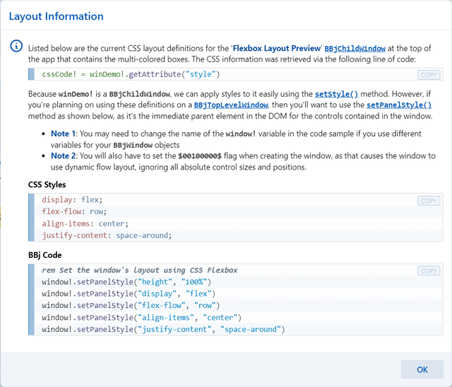
Example 1 - CSS Flexbox
Run DWCTraining/05_CssLayouts/DWCFlexbox.bbj:
- Select different flexbox settings
- Observe how boxes change with window resize
- Click [Show CSS] to see the generated styles

After picking a layout style, click the [Show CSS] button to see the CSS styles and BBj code:
Example 2 - CSS Grid Layouts
Run DWCTraining/05_CssLayouts/DWCGrid.bbj:
- Choose different layouts from the list
- Layouts 1-4: Basic column definitions
- Layouts 5-6: Fixed four columns (truncated when narrow)
- Layout 7:
repeat(auto-fit, 100px 200px)- columns increase with width - Layout 8: Media queries for 2/4/6 columns based on viewport
- Layout 9:
minmax()for flexible column widths
You can also experiment with CSS Grid layouts at cssgridplayground.com:

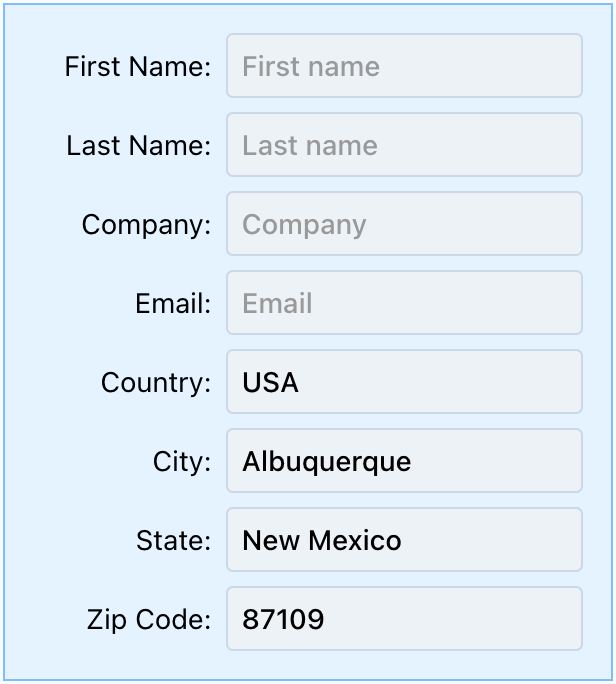
Responsive Form Example
Using CSS Grid with repeat(auto-fit, ...), forms automatically adjust columns based on available width:
Narrow window (2 columns):

Medium window (4 columns):

Wide window (6 columns):

Justification and Alignment
| Property | Axis | Affects |
|---|---|---|
justify-items | Horizontal | Items in grid |
align-items | Vertical | Items in grid |
justify-content | Horizontal | Entire grid in container |
align-content | Vertical | Entire grid in container |
justify-self | Horizontal | Override for single item |
align-self | Vertical | Override for single item |