DWC Controls With Extended Attributes
This chapter covers BBj controls implemented as web components for the Dynamic Web Client and their extended attributes.
Overview
In creating DWC controls, BASIS has added new functionality and configuration parameters based on today's web standards and customer requests. Many of these features are available as attributes listed in the DWC-specific documentation.
Concepts Covered in This Chapter
- Component themes for controls
- Attributes
- The BBjTree's built-in search
- Input control labels
Component Themes
Many controls offer a "theme" attribute that can be set to one of the DWC's component themes:
| Theme | Purpose | Default Color |
|---|---|---|
primary | Main color, typically brand-based | Blue |
default | Gray variations tinted with primary color | Light gray with blue tint |
info | Information to end-user, complementary to primary | Purple |
success | Denoting successful operations | Green |
warning | Presenting warnings | Yellow |
danger | Presenting problems | Red |
gray | Desaturated grays | Gray |
Color Properties
Theme colors are defined by CSS custom properties with three main properties:
- Hue - Degree on color wheel (0-360). Example:
--dwc-color-primary-h: 211;(blue) - Saturation - Percentage (0-100%). Example:
--dwc-color-primary-s: 100%;(bright) - Contrast threshold - When text should flip from white to black. Example:
--dwc-color-primary-c: 50%;
Colors range from 5% to 95% lightness: --dwc-color-primary-25 (dark) to --dwc-color-primary-85 (light).
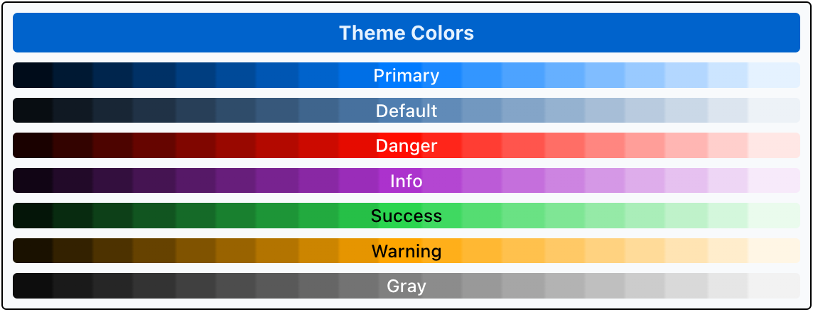
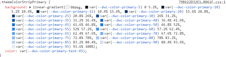
In effect, the DWC Themer only rewrites the underlying values of these CSS custom properties. When you pick a primary color with a BBjColorChooser, the DWC Themer takes the hue and saturation of the chosen color and uses them as the values of --dwc-color-primary-h and --dwc-color-primary-s. Some colors need a different contrast threshold. For example, --dwc-color-warning-c is set to 35 so that text on the yellow warning color stays legible.
Setting the Theme Attribute
Most controls offer the theme attribute as an easy way to set the control's appearance. Two samples from the first chapter use it.
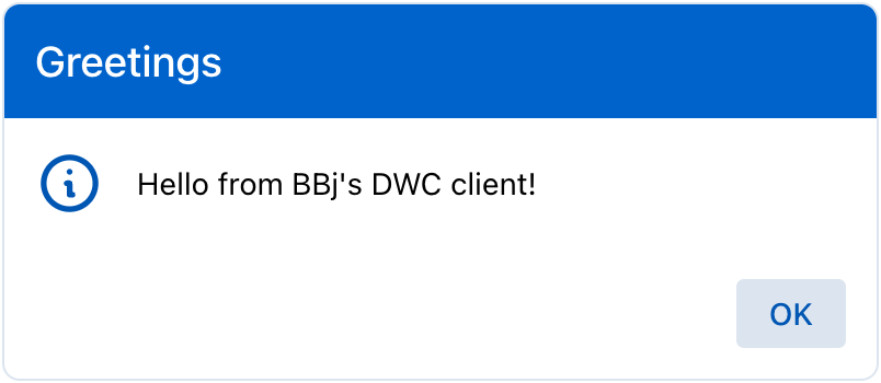
In MessageBox.bbj, the message box's theme is set to primary:
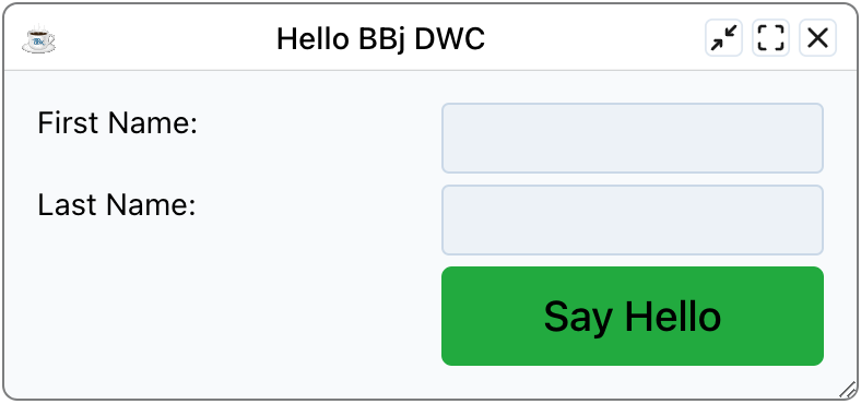
In DWC1.bbj, the [Say Hello] button's theme is set to success:
Attributes
DWC controls offer attributes providing extra functionality beyond GUI and BUI clients.
Common Attributes
- theme - Sets the control's color theme
- expanse - Shortcut for affecting font size and padding (controls overall size)
BBjTree Search Attributes
| Attribute | Description |
|---|---|
search-input | Shows edit box above tree for client-side filtering |
search-case-sensitive | Makes search case-sensitive |
search-nodata | Custom message when no search results |
search-placeholder | Placeholder text for search box |
search-term | Filter tree contents programmatically (supports regex) |
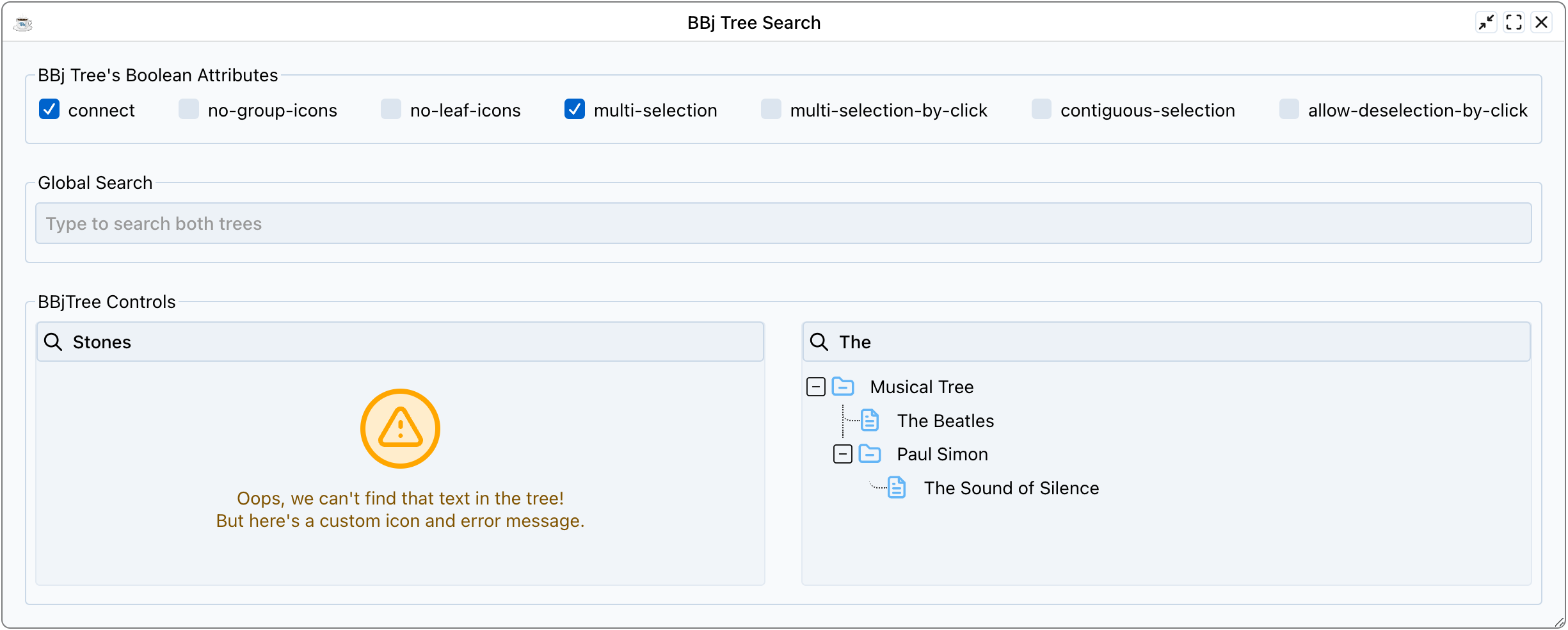
Example 1 - Setting Attributes on BBjTree
- Run
DWCTraining/04_ExtendedAttributes/TreeSearch.bbj - Toggle checkboxes to enable/disable named attributes
- Search in individual trees and via global search
- Note custom error messages via
search-nodataattribute - As time permits, read the source code and look at all the attributes it sets, including
search-input,search-placeholder,search-nodata,icon-collapsedandicon-expanded. The code also injects custom CSS that sets the--dwc-tree-icon-fillcustom property to a different value for each tree. The first tree paints its icons orange and the second paints them blue.
Input Control Labels
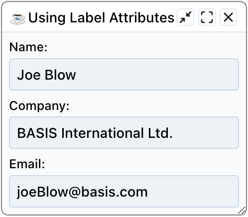
BBj input controls offer a "label" attribute that creates and places a label automatically.
Benefits of Attribute Labels
- Reduced developer work - No need to create, size, and place separate text controls
- Validation integration - Labels change color to denote valid/invalid states
- Accessibility - Narrators recognize the label as associated with the control
- Responsive layouts - Easier to design since labels are part of the control
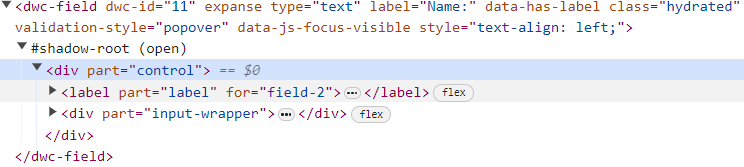
With attribute label:
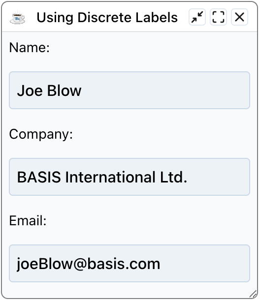
Without attribute label (separate BBjStaticText):

Example 2 - Comparing Label Types
- Run
DWCTraining/04_ExtendedAttributes/LabelAttributes.bbj - Choose "yes" for attribute labels, then run again and choose "no"
- Resize the window - notice how attribute labels stay with their inputs
Why Attribute Labels Work Better
With attribute labels: Labels are part of the control in the DOM, staying attached during resize.
With BBjStaticText: Labels are separate elements that can separate from inputs when resizing.